
Start with what the user needs
Think like the person standin’ in front a the screen. What they want first is clarity: readable text from three to five metres, colours that pop in daylight, and a simple way to change content. Begin with a clear brief—user hours, viewing distance, content type—so engineers and designers move in one direction. If you’re sizing a sample for a store or transit hub, test with an actual ad file on a led poster display early, not at the finish line. That early test saves time and money later.
Design choices that matter for the user
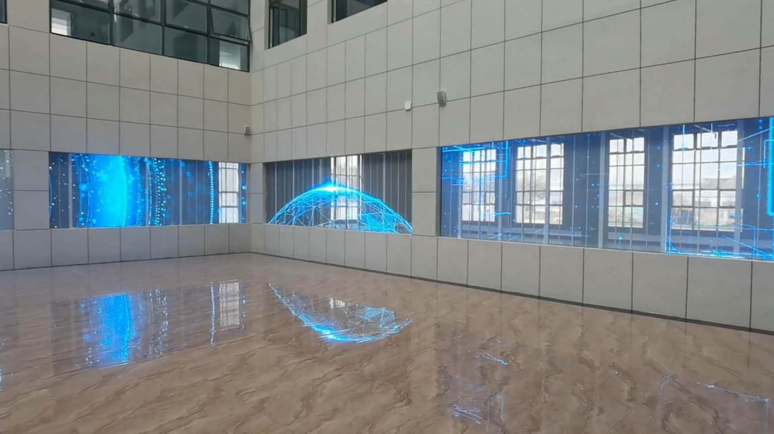
Keep decisions concrete. Pick pixel pitch based on viewing distance: 2.5–4mm for close retail, 4–6mm for mall corridors. Choose brightness in nits by environment—500–800 for indoor retail under skylights, 1,200+ for bright atriums. Prefer modular panels so a single faulty module swaps fast. Software must let the brand push content remotely and preview before go-live. Mention warranty terms up front; users care about uptime more than specs. These choices change how the product feels to the buyer and how long the display keeps working without drama.
Common pitfalls users and teams hit
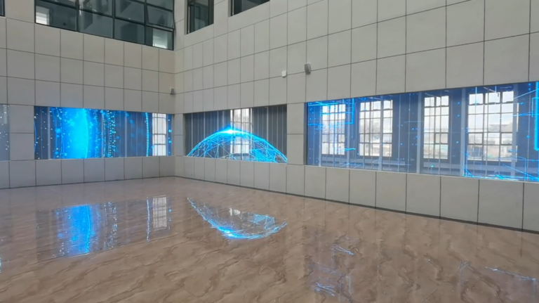
Teams rush to cheaper modules and then fight colour drift after a few months. Designers deliver art that’s unreadable at scale. Installers forget service access and the display gets bolted into a frame that makes maintenance hours-long. Avoid custom connectors with one-source suppliers. Forgetting ambient light measurement is costly—brightness set wrong, and your message looks washed out or burns batteries. Test content on the actual hardware under the same light and viewing angles you expect the real audience to use.
Real-world test and validation
Real proof come from busy places where signage must work without excuses. Times Square shows how small-format video and poster systems perform under heavy foot traffic and wide daylight; buyers study those deployments and trade reports. For a hands-on validation, we deploy a controlled pilot and test playback, heat, and control latency across a week-long run; that’s how the average faults surface. For concrete reference, I’ve compared prototype runs against typical commercial installations using a led poster video display to measure brightness stability and content scheduling reliability—those tests tell you what needs fixing before wide rollout.
Alternatives and when they fit
If budget or power is tight, consider high-brightness LCD poster units for static-rich campaigns; they cost less and integrate with simpler CMS setups. For ultra-low-change signage, e-paper wins on power but loses on motion and colour. Micro-LED prototypes offer superior contrast but raise cost and lead time. Choose by match: audience behaviour, content cadence, and maintenance capability. Don’t pick tech because it’s trendy—pick tech that solves the user’s daily problems.
Delivery, installation, and handoff
Plan delivery like you plan a stage setup. Include spare modules, a service plan, and clear instructions for local teams. On installation day, verify network rights, remote-control credentials, and a rollback playlist so content keeps running if the feed hiccups. Train one local contact on basic diagnostics: reboot routines, module replacement, and where to find spare parts. Handover documents must be short and practical—no long spec dumps that nobody reads.
Where the solution meets the need
When the user sees clear text, consistent colour, and a content schedule that updates without sweat, the job done right. That outcome comes from testing, honest specs, and a partner who stands by field results. For practical deployments and a track record of tested poster products, teams we work with often go with suppliers that show measurements, service plans, and live demos—one such dependable option sits at HDC, and the fit speaks for itself when the display is live and working every day.